Learn more about how 3YOURMIND's dashboard analytics can help make sense of your additive manufacturing data.
Nowadays, everyone is talking about the importance of 'data-driven' decision-making, even in the additive manufacturing world. But how can organizations eliminate 'gut-feeling' decisions if they don't have access to the right information, let alone know how to interpret it?
Additive manufacturing is no stranger to data; it can be your best friend or your own worst enemy. To address this, 3YOURMIND developed dashboard analytics based on feedback from customers regarding the data that's most important to visualize.
What we've encountered from user feedback is that customers want to be able to easily view which 3D parts offer the most cost and lead time savings. But more than that, they want to be able to filter these lists so they can get accurate estimations for the parts that are most important to them.
So that's what we did.
Read on to learn a few simple tricks for getting the most out of 3YOURMIND's dashboard analytics.
View Cost and Leadtime Savings Across All Parts
Looking for opportunities to gain some quick wins using additive manufacturing? We can help with that.
Log in to the AM Part Identifier Panel and head to the parts list overview.
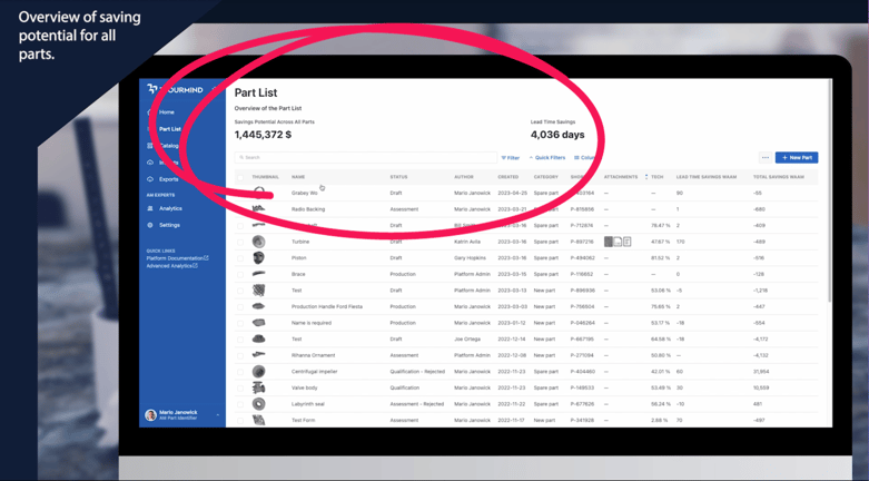
Pictured: Total cost and lead time savings from parts in the parts list.
At the top of the page, you can view the savings potential across all parts, as well as the total lead time savings. From this view, you can sort each column in ascending and descending order.
But what if you want to see the cost and lead time savings for only a few parts based on specific factors?
Simply navigate to the filter icon to select your primary category. For example, you can filter by part category, like spare parts, to get a view of the lead time and cost savings of just your spare parts. If you'd like a more granular view, you can apply a secondary filter, like weight, and whether it's less than, greater than, or equal to your chosen weight. Once applied, the calculations at the top of the page will adjust to reflect your newly filtered list.
Visualize Trends With Graphic Data
Users with AM Expert privileges can access the analytics dashboard to see visual representations of their data. For example, experts can quickly visualize the number of parts they have based on categories like new parts, spare parts, or prototypes. Experts can also view the percentage of parts based on material class or quickly gain an overview of all of their parts based on their project status.
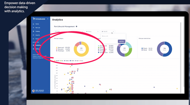
Pictured: From the analytics dashboard, view graphs based on parts per category, part status, parts per material class, and more.
In addition, expert users can also sort the dashboard analytics by part ID, status, category, and date to drill down data.
For example, by selecting 'last month' from the 'date' drop-down menu, expert users can get an overview of activity from the past month, which can be helpful in reporting and sharing information with decision-makers.
Quickly See Your Highest (and Lowest) Performing Parts
Want to see which parts offer the most AM potential? There's a graph for that.
By looking at the scatter plot, you can see each part based on total savings on the x-axis and lead time savings on the y-axis. Parts plotted near the top right of the graph have the greatest savings potential.
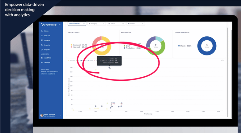
Pictured: On the scatter plot, you can quickly view how individual parts compare based on lead time and cost savings.
By hovering over the plotted point, you can see the specific part ID, lead time savings based on technology, and total savings based on technology. This visual information is helpful to understand the overall economic performance of your part inventory quickly.
Stay Up to Date on Production Performance
To get even more analytics information, head to the advanced analytics link under ‘quick links’ in the left navigation panel.
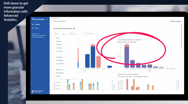 Pictured: From the advanced analytics dashboard, managers can view additional graphs that can aid decision-making.
From the advanced analytics dashboard, expert users can get an in-depth view of the part lifecycle management information.
In addition, experts can select different charts to view how parts are being ordered, which users are active within the software, and at what facilities users are located.
Finally, for organizations with in-house production capabilities enabled, expert users can gain an overview of production analytics, which can be filtered based on date range, location, and specific technology.
See 3YOURMIND's Dashboard Analytics in Action – Watch the Demo!
Want to learn more about 3YOURMIND's dashboard analytics? Reach out to us with your questions!